
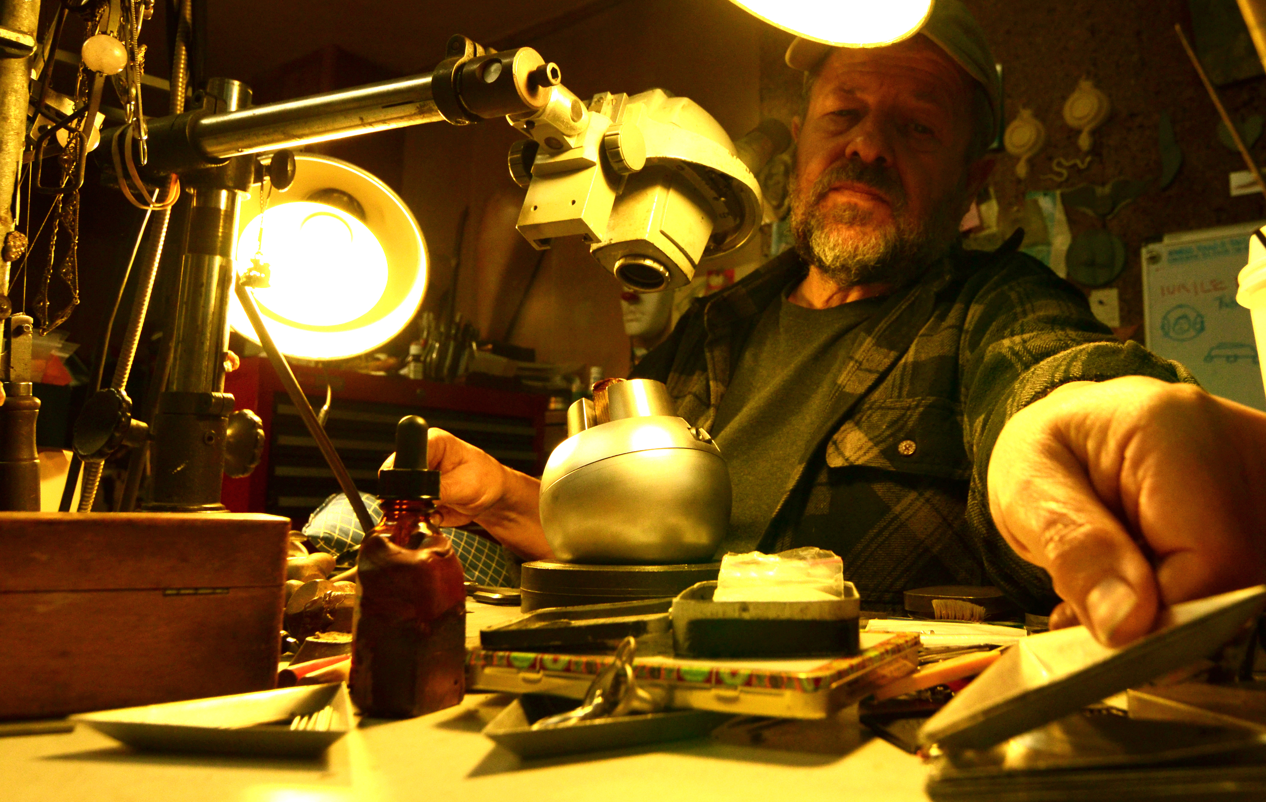
There is a little-known link between the art of the goldsmith and the art of typography. When you think about it, though, the connection is obvious. Who better to carve out of metal the precise, intricately-detailed fonts of movable type than a skilled metal-worker? Johannes Gutenberg himself started out as a goldsmith. And many of the tools of the typographer's trade—such as the punchcutters, pantrographs, and engraving machines—originated in the craft of jewelry.
Of course, these are the same tools still used by our own master goldsmith, Tony Lent, so it seemed especially fitting when we had the opportunity to collaborate with typographer Lucas Sharp and his branding agency Sharp Type. Lucas and his partners have worked on many exciting projects over the years. His past clients have included Pinterest, Zazzle, and Samsung. His typefaces have been featured far and wide, including on the cover of the New York Times Magazine and, most recently, as part of the official branding of the Hilary Clinton for President 2016 campaign.
When we approached him to design a new logotype for Anthony Lent, it was love at first sight on both sides. We loved his work. He loved ours. And so a collaboration was born. Together with his partner Chantra, he planned an entirely new look for us. Instead of a mere update to our logotype, he produced for us a series of complete, gorgeous fonts. And it's a fitting font, too.
Based on the work of the Jesuit scholar, Edward Catich, who studied the inscription on Trajan's Column in Rome, it aims to replicate in an elegant, modern form the most sublime achievement of the ancient Roman brushstroke. Catich proposed that the serif, that vestige of calligraphy preserved in so-called Roman typefaces, was not simply an imitation of letterforms perfected by expert stoneworkers following mathematical principles. Rather, the letters were first painted, then chiseled out, and then painted again. As public proclamations standing in the open air, they were designed to emphasize light and shadow for the sake of legibility.
The carving required dexterity, perhaps, but the true significance of the letters was in the way they communicated meaning through art, creating a link between text and reader by a subtle, almost invisible modification of nature. These kinds of details—easy to miss but essential to artistic integrity—are fundamental to Tony's work, as well. His pieces celebrate exactly these kinds of details, each one containing secrets of form and function that, like the Roman letters, hide in plain sight. Ask him about his "Wandering Eye" design, for example, and why its pupil is shaped like a heart, and he'll tell you that it, too, is designed to reflect light in just the right way: to put a real sparkle in a an unreal eye.
The result of Lucas' typographic talents is a series of fonts we think are instant classics, exactly the sorts of timeless masterpieces Tony himself turns out again and again. We're thrilled to be using them and to do our part to draw attention to this too-often neglected, but extremely vital art. We're also proud to introduce new logos and a new design for our website and catalogs, courtesy of Chantra.
We've been working closely for months to bring this dream to reality, a dream that began with a short email and a simple request and ended up blossoming into a new face for the brand that puts a human face on luxury. Lucas and Chantra have helped us finally give Tony's work the presentation it deserves and have reminded us that there's as much "precious metal" in the printed word as there is gold in our jewelry. You might say, they were just our type.